Appearance refresh
Dec 24, 2025 · 1 min read
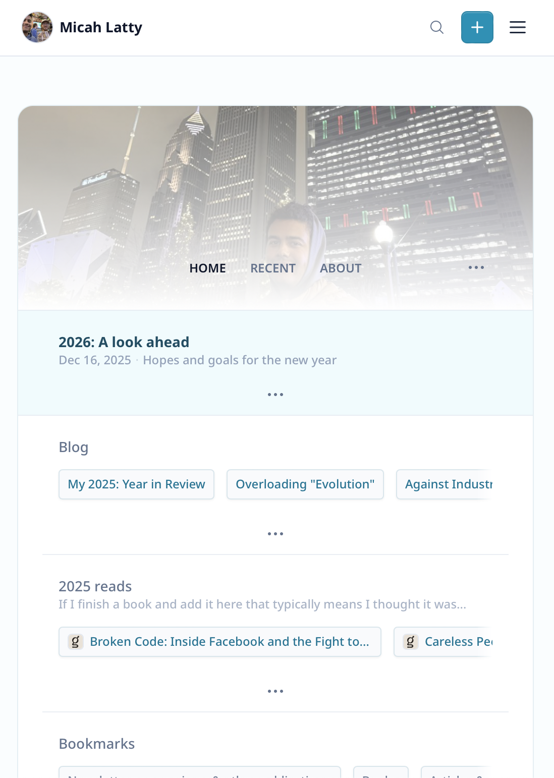
Released a bunch of visual updates that make Linkfount easier to use and (to my eye) nicer to look at.
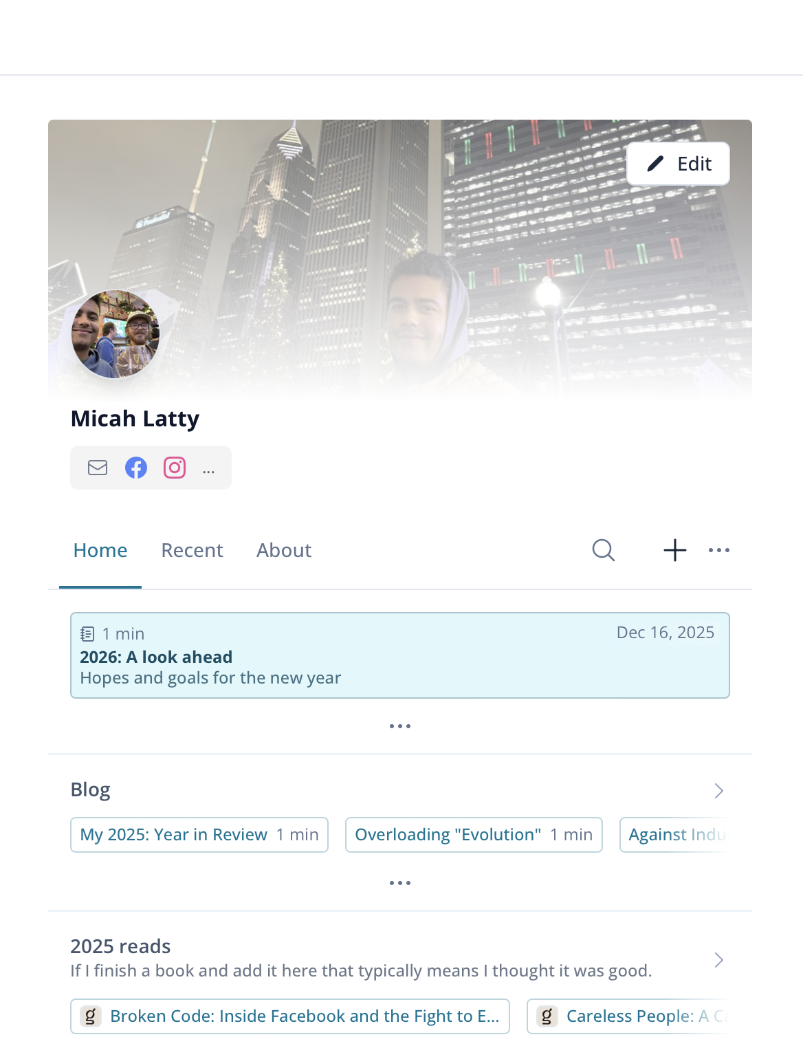
Before:
 After:
A few highlights
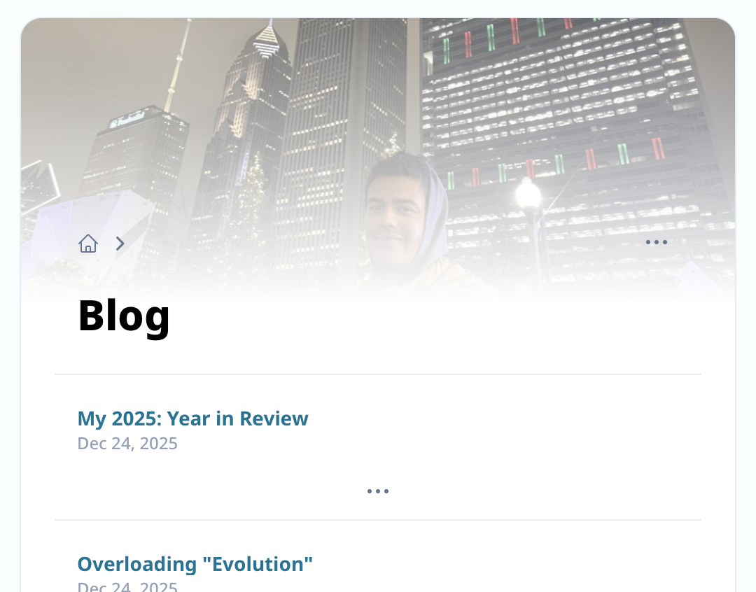
Cover photo appears on sub-lists and other pages instead of just homepage:
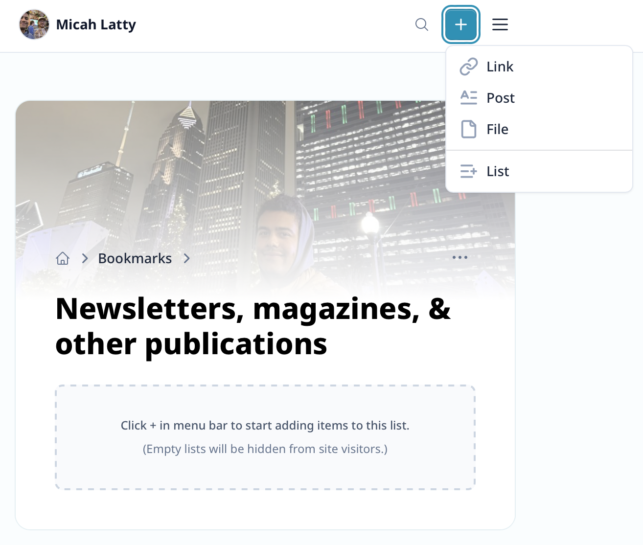
On empty lists, user gets guidance where to click in order to add new items (+ button is highlighted when gray area is hovered-over, dropdown opens when gray area clicked!).
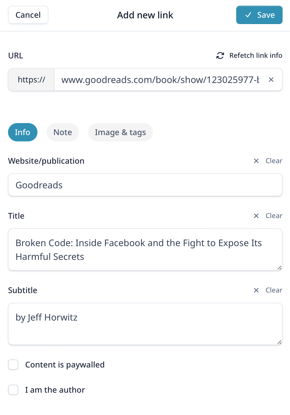
Item creation forms are visually simplified by splitting less-used options into secondary tabs (Note, Images, etc.)
I initially designed this platform to be optimized for mobile (most visitors will likely be on mobile devices). However, this meant that on desktop the UI felt oddly cramped. Just released a bunch of updates to take more advantage of the full width of desktop layouts. This gives both the list views and various content-...
Continue reading